
The range
T-shirts
Two ranges on one shelf. CHARACTER shirts put a figure on the chest and that character's own register on the back. SIGNAL shirts carry a single generated mark and no character at all, for people who want the idea and not the toy. Both are printed in one ink on one cloth, and every one of them is composed from the libraries this site already runs on — a shirt is not a picture of a character, it is that character placed on cloth.
Where this came from
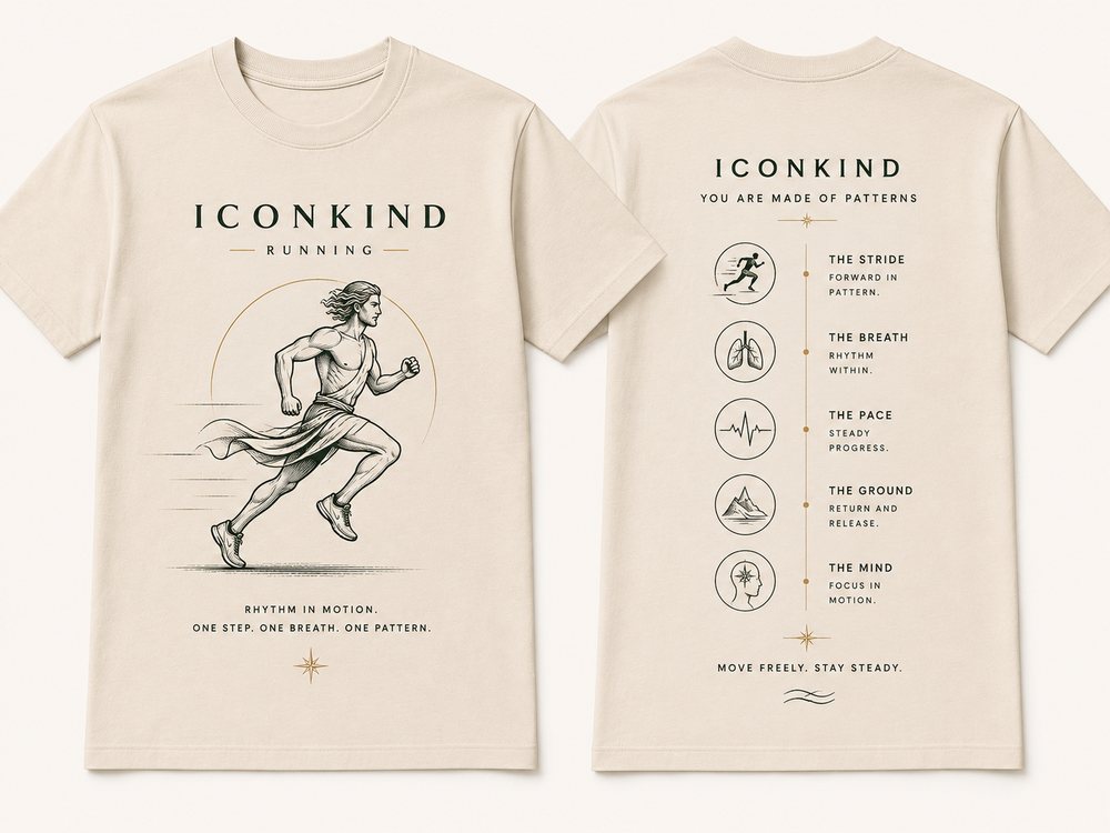
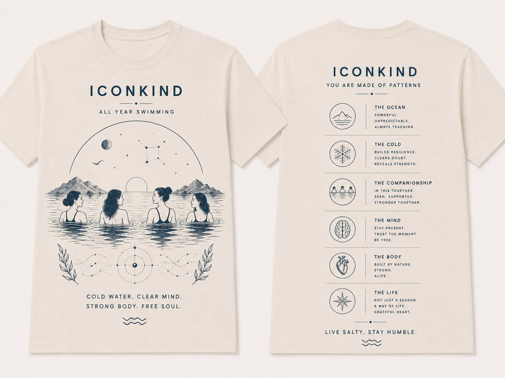
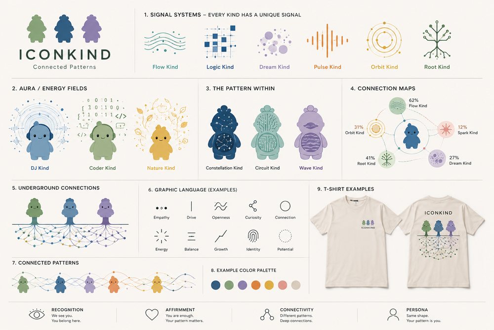
The moodboard on the left, in Graham's own hand, and what it became on the right. Shown side by side because the useful question is not whether the interpretation is faithful — it is what got KEPT, what got translated, and what got dropped on purpose. The originals are generated images: beautiful, and not assets. Everything on the right is a file a printer can open.

Moodboard — original
Built — vector
The cycling board
KEPT: the whole idea. This is the strongest board of the set and the reason is that it is a DIAGRAM of a person rather than a portrait of one — construction circles, leaders, annotated forces, real equations. TRANSLATED: all of that apparatus is now vector and generated. DROPPED: nothing, except the rider, who is the one thing worth commissioning.
Moodboard — original
The running board
KEPT: the idea, which is the best on the board — a classical athlete in a chiton wearing modern trainers. Anachronism is a hook and it ties “iconic” to actual icons. NOT BUILT: deliberately. The anatomy at the hip and the trailing leg is off in a way that reads as generated at shirt scale, and the trainers, which are the entire joke, are almost hidden. This is the first thing to put in front of a real illustrator.
Moodboard — original
Built — vector
The cold-water board
KEPT: the back panel, which is the strongest on the whole moodboard, and the voice. DROPPED: the four swimmers. Four rendered faces are four chances to look generated and two of them do; it is also the single most copied image in cold-water swimming merchandise, and it pins the customer to one demographic. REPLACED BY: a specimen plate, which needs no figure at all and which this brand has a claim on because it already issues binomials.
Moodboard — original
The Connected Patterns system sheet
KEPT: all of it, and it turned out to be the most important board of the lot. Signal Systems, The Pattern Within and Connection Maps were drawn by hand as a mock-up. They are GENERATED now — every signal from a kind's five trait scores, every connection map from the real kin percentages. See the signals and the register panels further down this page.
Character shirts
Front and back of one garment. The chest print is deliberately small: a character at that scale reads as a badge somebody chose, not as merchandise. The back is that character's own record — the trait bars are its five scores, the connection map is its kin list with the real percentages, the dot strip is its code. None of it was written for the shirt. If the character changes, the shirt changes.
Front
Back
The Explorer
Iconkind hinnulus var. viator
Natural cream · one-colour print, front and back
Front
Back
Wisp
Iconkind nebula
Navy · cream print, front and back
Front
Back
Chalk
Iconkind tabula var. magister
White · one-colour print, front and back
Elements of Greatness
The moodboard poster of this name is a stock periodic table with the wordmark over it — a strong idea that anybody could sell, because there is nothing of this brand in it beyond the name. This is the version only iconkind can print. The elements ARE the cast: the atomic number is the register number, the symbol is derived from the name and collision-checked, and the column a kind sits in is its dominant trait, read from the same five scores that drive the signals and the panels. Copy the design and you still cannot make one, because you would need the cast that produces it.
AND THERE IS A HOLE IN IT. Nothing in the cast is dominant in COURAGE — eleven are heart, eight mind, six energy, six roots, and that column is empty. Mendeleev left gaps for elements nobody had found yet and used them to predict what would fill them, so the column stays, labelled UNFOUND. It is an honest report of the data and it is also a brief: it says a kind is missing, and it says exactly what that kind would be like.
The product is the asymmetry. One BACK for everybody, because the system is the system. A personalised FRONT per character — the one you were given, with its number, its rarity, its five scores and its binomial. Thirty-one fronts exist already and the table grows a cell the day the cast does.
Front
Back
The Explorer — element 9
Iconkind hinnulus var. viator
Natural cream · front card, back table
Front
Back
Beacon — element 29
Iconkind aura var. vigil
Natural cream · front card, back table
Back
The table alone
Be iconic. Be kind.
Navy · cream print — the whole system, no front card
The pair — two trees, one wood
The couples range: Valentine's, an engagement, an anniversary, or two people who simply like being two people. Both trees LEAN, which is what separates a pair from two trees standing near each other — and the lean is drawn in coordinates rather than applied as a rotation, so there is nothing at the printer to go wrong and nothing this repo cannot check. Below the line their roots interlace, and the number of strands is the number of code positions the two kinds actually share. There is no heart: on a drawing whose whole argument is that the connection is real and measured, a heart is the one shape that says greeting card. The roots already say it, and they say it truthfully.
THERE IS A TRAP IN THIS AND IT HAD TO BE DESIGNED AROUND. The connection between two kinds is a real number computed from their codes, and a real number can be low. “You are 20% compatible” is a terrible thing to hand somebody on Valentine's Day. There were three ways out and only one of them was honest: hide the number and the mechanic is gone; fake it high and the brand is lying, which wastes the only thing a generated system is good for. So the number stays true and stops being a verdict — the READING is the headline and the percentage is a footnote at six point, and the reading is chosen BY the number rather than in spite of it.
Which makes the low scores the better product. The bands are the QUARTILES of the real distribution rather than round numbers — all forty-five kind pairs run from 0 to 73 with quartiles at 20, 33 and 40 — because a threshold at 60 put only four pairs in the top band and two of three sample garments came out carrying the same line. Cut where the data actually divides, and the four readings spread across the range. Wisp and Root share 13% and get “Opposite in almost everything. Holding on anyway.” That is the shirt most couples actually want, and it is only sayable because the number was never massaged.
Back
Two trees — Wisp and Orbit
Grown the same way. Still two trees.
Natural cream · 73% shared · top quartile
Back
Two trees — Wisp and Pebble
Different patterns. Deep connections.
Blush · 40% shared · Valentine's, engagement
Back
Two trees — Spark and Pebble
Nothing in common. Everything in common.
Natural cream · 20% shared
Back
Two trees — Wisp and Root
Opposite in almost everything. Holding on anyway.
Slate · 13% shared · the honest one
Connected Patterns — the scene register
The moodboard's trees are drawn in the CHARACTER's language, not the engraved one: flat fill, no outline, and the same face — the eyes at the same place, the same mouth. They are not an illustration of the brand, they are the brand's own hand applied to a subject instead of to a person. That makes it a third register and a proper FORM, in the same sense merkind and dinokind are: a different body wearing the same head. The canopy is built so the eye line still lands at y 129 and the mouth zone at x 92-108, which is why every iconkind face drops straight in with no redraw. That constraint is the entire reason the trees read as family rather than as clip art.
THE ROOTS ARE THE DATA. Every kind has a fifteen-position code, and similarity is how many positions two of them hold in common — the same measure the register already publishes as kin. Here it decides how many strands run between two trees and how heavy they are: one strand per fifteen points shared, with weight and opacity to match. Wisp and Orbit share 73% and it looks like a cable; Root and Gleam share 27% and it looks like a thread. The moodboard drew a pretty network. This one is a picture of something true, and it cost nothing extra because the numbers were already there.
Back
Connected Patterns — three
Stronger together. Better for all.
Natural cream · Wisp, Orbit and Pebble · 73% and 47%
Back
A wood of five
Stronger together. Better for all.
Natural cream · Sprout, Breeze, Pebble, Root and Gleam
The activity range
No character on any of these. Yoga, cold-water swimming, cycling and running are about the WORLD, and putting a figure here would make it compete with a better picture of the same person. The front is one drawn subject in a circle with the affirmation under it; the back is the five-roundel panel the moodboard kept sketching — and the roundels are the same drawings as the front, so a new activity costs a list of five subjects and fifteen short lines rather than five new illustrations.
Front
Back
Yoga
Breathe deeply. Move mindfully. Live fully.
Natural cream · dark print, front and back
Front
Back
All year swimming
Cold water. Clear mind. Strong body. Free soul.
Navy · cream print, front and back
Front
Back
Cycling
Motion is rhythm. Rhythm is power.
Slate · cream print, front and back
Front
Back
Running
One step. One breath. One pattern.
Sage · cream print, front and back
Bitmap or vector
Both — split by job, which is the answer rather than a compromise. THE FRAME IS VECTOR AND THE FIGURE IS RASTER. Everything constructed — the apparatus, the roundels, the wordmark, and every piece of type — stays as paths, because it has to recolour per cloth, compose at any size, be checked against the print spec, and above all because rasterised type at print size is the single clearest tell of a cheap garment. The one thing that should NOT be vector is detailed engraved figure work: forcing crosshatched anatomy into paths costs ten times the effort and produces something worse. A screen printer takes a 300dpi bitmap happily.
The consequence is the useful part. The strongest board in the moodboard — the cyclist as an engineering study — is a DIAGRAM of a person rather than a PORTRAIT of one, and that is why it does not fight the characters: a character says “this is you”, and a rendered face beside it says “no, THIS is you, and better drawn”, while a diagram only says “this is what you are doing and here is why it works”. It is also the most reproducible of the three figurative registers, not the least, because circles, leaders, dimensions and equations are geometry and type. The two studies below are that apparatus built. The third is not a product: it is the brief — the slot, the resolution, and the rule that no type goes inside the bitmap.
Front
Back
Study — Cycling
Motion is rhythm. Rhythm is power.
Natural cream · dark print · frame vector, no commission needed
Front
Back
Plate IV — Hippocampus
Cold water. Clear mind. Strong body. Free soul.
Navy · cream print · a specimen plate needs no figure at all
Front
The artwork specification
The frame is vector. The figure is raster.
Not a product — the brief to hand an illustrator
Signal shirts
One mark, one line, no character. The signal is generated from the kind's five trait scores — the FORM is chosen by whichever trait is highest and the parameters come from all five, so no two kinds produce the same drawing. This is the half of the range that can go anywhere the characters cannot: plain, adult, and still nobody else's.
Front
Signal — Spark
Energy finds a way
Clay · dark print
Front
Signal — Root
Deep roots hold
Sage · cream print
Front
Signal — Orbit
The pattern within
Navy · cream print
Front
The graphic language
A vocabulary, not a slogan
Natural cream · dark print
The subjects
Twenty-two of them, in one ink and three stroke weights, and they are the only part of this brand that is DRAWN rather than generated. Each has to survive two sizes — a 25mm roundel on the back of a shirt and a 200mm print on the front — which is a manufacturing constraint, not a preference: at 25mm one unit is 0.21mm and a screen will not hold a line under 0.25mm. tools/check-print.mjs enforces it, including through every nested transform, because a subject can pass in its own box and still arrive at the screen too fine once it is inside a roundel inside a panel inside a garment. That is exactly what happened the first time.
wave
shell
seahorse
seal
kelp
gull
moon
sun
mountain
horizon
tree
roots
leaf
fern
lotus
flame
feather
compass
wheel
anchor
daymark
thermometer
The ten signals
Every kind has one, and every one is computed. They are also the middle rung between the figures and the engraved end of the moodboard: single weight, no fill, about as complex as a badge — which is what lets a chibi character and a hairline engraving sit in the same range without either having to become the other.
spark
wisp
orbit
sprout
gleam
pebble
root
breeze
fawn
slate
How the range holds together
The two ends never share a garment.
A realistic engraved figure and a chibi character on one shirt read as two brands arguing. They share a FRAME instead: one ink, one cloth, the wordmark lockup, the three-line affirmation, and the register on the back. That frame is what the eye reads as one brand — not the drawing style.
Engrave the world, not people.
If the engravings are the ocean, a wave, a tree, a seahorse, a moon — and the characters are the people — the two never compete. The moment a realistic human is on the shirt, the character stops being you and becomes a mascot standing next to a better drawing of you.
The generated half cannot be copied.
A signal or a register panel is computed from a cast nobody else has. That is a different kind of asset from an illustration, and it is the one worth building the range on.
What is still missing.
Twelve to twenty engraved SUBJECTS in one weight — wave, moon, tree, root system, seahorse, compass, shell, flame — drawn as vector rather than generated as images. That is what lets the range cover yoga, swimming, cycling and running without a character on every shirt.
The garment spec
Nine named cloths, two faces, eleven type roles and the print rules — and the sheet below is GENERATED from brand/tshirt.spec.json rather than typed out, because a spec sheet written by hand is a second copy of the spec and a second copy drifts. That is the exact failure this spec was written to stop: an audit found six copies of the garment outline across six builders, the wordmark set five different ways, three spellings of the serif fallback, and the name “slate” meaning two different cloths in the same range. Rename a cloth here and the sheet renames it; take a rung off the type scale and the sheet loses the rung.
The builders read the same file, so no garment can be drawn in a cloth or at a size the spec does not know about — and check-print refuses one that tries, along with a font family that is not one of the two. The faces are placeholders for the real licensed pair, named in one place so that swapping them is a single edit rather than a search across nine hundred files.

© 2026 Freetek Ltd · ICONKIND is a registered trade mark of Freetek Ltd.